
Logo Design vs Brand Identity — What's the Difference?
It's a question I hear all the time, and it's a genuinely important one: what's the difference between a logo and a brand identity?
People use these terms interchangeably, but they're not the same thing. Confusing them is a bit like confusing a front door with an entire house — one is part of the other, but they're very different in scope, function, and impact.
Understanding the difference will help you make smarter decisions about your design investment, communicate more clearly with your designer, and — most importantly — build something that actually works in the real world.
Let's break it down.
What Is a Logo?
A logo is a mark. It's a single visual element — usually a combination of a symbol, wordmark, or both — that represents your business in its most distilled form. It's designed to be instantly recognisable, versatile across different sizes and contexts, and memorable at a glance.
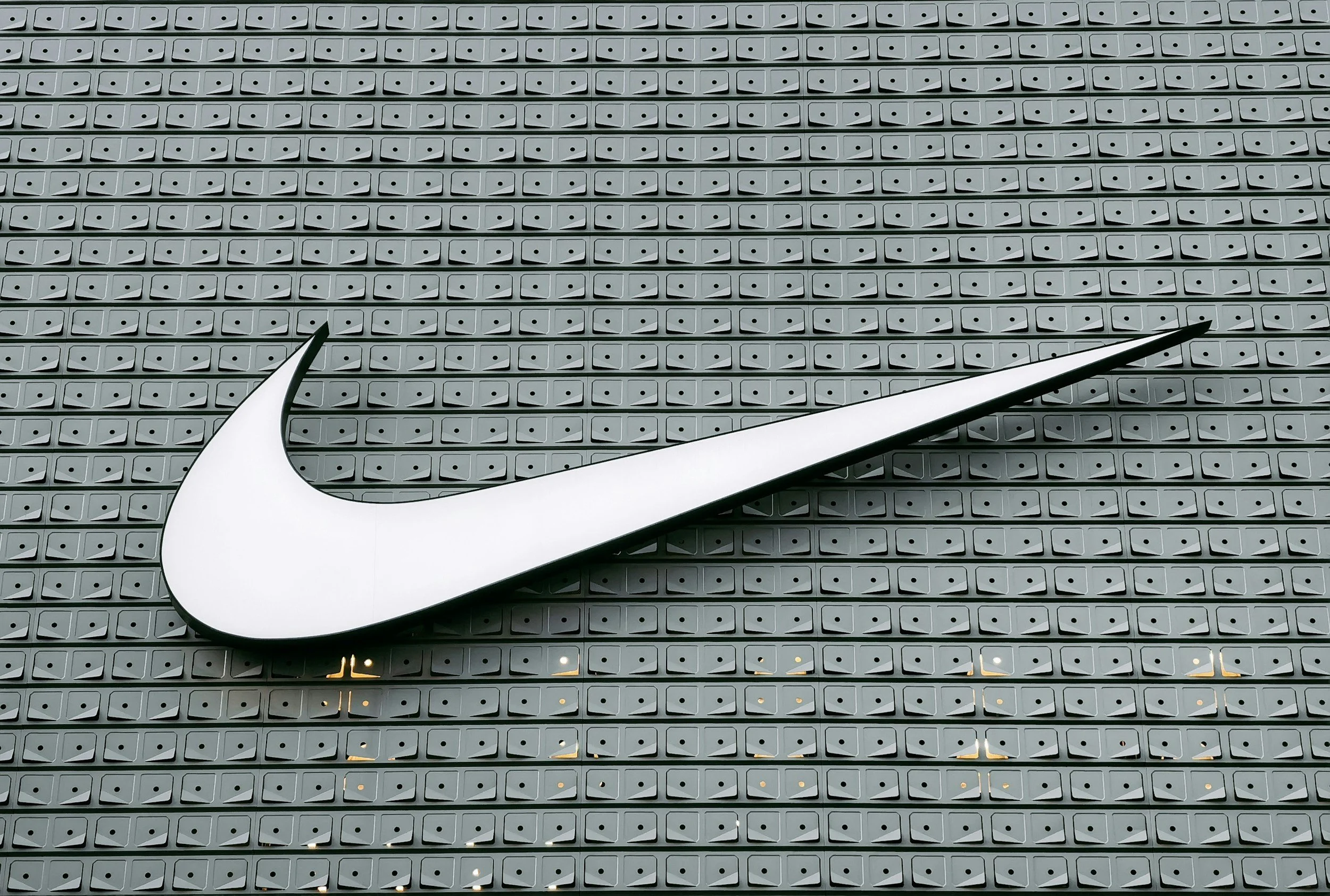
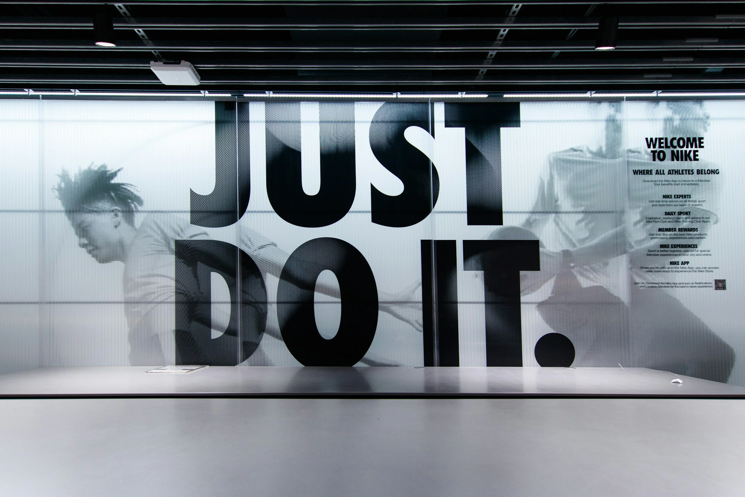
Think of the Apple logo. The Nike swoosh. The McDonald's arches. These are logos — simple, singular, unmistakable.
A great logo does a few things brilliantly: it identifies your business, it communicates something about your values or personality, and it works whether it's 5cm on a business card or 5 metres on a billboard.
What a logo doesn't do is tell the whole story. That's where brand identity comes in.
What Is a Brand Identity?
Brand identity is the complete visual system that surrounds your logo. It's everything that makes your brand look and feel consistent across every single touchpoint — from your website to your packaging, your social media to your signage, your email templates to your printed brochures.
A brand identity typically includes:
Primary logo — your main mark in its full form
Logo variations — stacked, horizontal, icon-only, reversed versions for different contexts
Colour palette — a defined set of primary and secondary brand colours, with exact values (HEX, CMYK, Pantone) for consistent reproduction
Typography — the specific fonts your brand uses, and the rules for how they're applied (headings, body copy, captions)
Imagery style — guidelines for the type of photography or illustration that fits your brand
Graphic elements — patterns, textures, icons, shapes that form a recognisable visual language
Brand guidelines — the document that pulls all of this together and tells anyone using your brand how to do it correctly
Together, these elements create something much more powerful than a logo alone: a system that makes your brand instantly recognisable, regardless of where it appears.
Why Does the Difference Matter?
Here's a scenario. You commission a logo. It looks great on your email signature. But then you build your website and you're not sure which colours to use, so you pick a few that feel right. You create social posts and use a different font each time because nothing feels quite consistent. Your brochure uses a slightly different version of your logo because the designer who made it didn't have the right files. Your business cards look a bit different from your website.
The result? A brand that feels fragmented. One that doesn't build trust or recognition over time.
Now imagine the alternative. Every piece of communication — digital and print — uses the same colours, the same fonts, the same visual language. Customers start to recognise you before they've even read your name. That's brand identity working.
So Which Do You Actually Need?
The honest answer is: it depends on where you are in your business journey.
A logo alone might be right for you if:
You're just starting out and need something professional quickly
Your business has a single, simple offering
You're testing a concept before investing more heavily
Your touchpoints are limited (just a website and social media, for example)
A full brand identity is right for you if:
You're serious about building a recognisable, lasting brand
You operate across multiple channels (print, digital, packaging, signage)
You have a team who needs to produce branded materials independently
You're rebranding an existing business
You want to attract a higher-calibre client or customer
Most established small businesses benefit enormously from at least a core brand identity — logo, colour palette, typography, and basic guidelines — even if they don't need the full suite.
What Does a Brand Identity Project Look Like?
Working with a designer on a brand identity project is a collaborative, strategic process. It typically involves:
Discovery — Understanding your business, your audience, your competitors, your values, and your ambitions. This is where we ask the questions most people haven't thought to answer.
Visual research — Mood-boarding, exploring directions, establishing a visual territory that's distinctly yours.
Concept development — Creating logo concepts and beginning to build the visual system around them.
Refinement — Working through feedback, refining the chosen direction, testing it across real applications.
Delivery — Handing over a complete set of files and a brand guidelines document that gives you everything you need to use your identity confidently.
This process takes longer than a logo-only project, and it costs more — but the output is a complete toolkit that your business can use for years.
The Bottom Line
A logo is where your brand identity starts. But it's not where it ends.
If you want your business to look professional, consistent, and credible at every touchpoint — you need more than a mark. You need a system.
At Joe Woodley Design, I work with small businesses and organisations across Suffolk and the UK to create brand identities that are clear, considered, and built to last. Whether you're starting from scratch or ready to level up what you've already got, let's talk.
Joe Woodley Design is a freelance graphic design studio based in Bury St Edmunds, Suffolk.