
5 Signs Your Brand Needs a Refresh
Brands age. It happens to all of them — even the good ones.
What felt bold and fresh when you launched can start to feel dated, misaligned, or just... off. And often, business owners are the last to notice — because they're too close to it, too used to it, too busy running the actual business to step back and look with fresh eyes.
So here are five clear signs that your brand might be quietly holding you back — and what to do about it.
1. Your Logo Looks Terrible at Small Sizes (or Large Ones)
This is one of the most common — and most overlooked — signs of a brand in need of help.
If your logo was designed in the early days of your business, it might have been built for one specific use case: maybe a website, maybe a printed flyer. But today, your brand has to work everywhere — as a tiny favicon in a browser tab, as a profile picture on Instagram, as large-format signage, on a phone screen, on a retina display.
If your logo is too complex to work at small sizes, too thin to reproduce in one colour, or just doesn't hold up when scaled, that's a technical failure that a refresh can fix. A strong logo is built for versatility from day one — and if yours isn't, it's costing you.
Ask yourself: Does my logo look sharp and clear at every size? Does it work in black and white? Could it work as a simple icon?
2. Your Business Has Changed, But Your Brand Hasn't
Businesses evolve. Services get added, dropped, or refined. You find your niche. You move upmarket. You attract a different type of client. You pivot entirely.
If your brand was built to represent the business you were — rather than the business you are — there's going to be a disconnect. And customers feel that disconnect, even if they can't articulate it.
A brand should be a true reflection of your current offer, your current values, and the audience you're trying to attract. If it isn't, you're marketing the wrong story.
Ask yourself: Does my brand still accurately represent what I do, who I serve, and what makes me different?
3. You're Embarrassed to Hand Out Your Business Card
This one stings — but it's worth sitting with.
Do you hesitate before sending someone to your website? Do you cringe slightly when someone asks for your business card? Do you apologise for your branding before people have even looked at it?
If the answer to any of those is yes, your brand is actively damaging your confidence — and your business. Your brand should make you proud. It should feel like a proper representation of the quality of your work. If it doesn't, that energy comes across.
The most successful businesses are led by people who genuinely believe in what they're putting out. Your brand should support that, not undermine it.
Ask yourself: Would I be proud to show my brand to my ideal client, right now, without apologising?
4. You Look Like Everyone Else in Your Industry
Stand back and look at your competitors. Now look at your brand. Do you look the same? Use the same colours? Have a similar logo? Sound the same?
In most industries, there's a default visual language — a set of unspoken rules that everyone seems to follow without questioning. Accountants go navy and grey. Wellness brands go sage green and white. Tradespeople go red, white, and blue. Construction companies use bold, blocky fonts.
Following these conventions might make you feel safe, but it's actually a competitive disadvantage. If you look like everyone else, you give potential customers no reason to choose you over the person next to you.
A distinctive, considered brand identity is one of the most powerful ways to stand out in a crowded market — not by being loud, but by being clearly, confidently you.
Ask yourself: If you removed your name from your brand, could it be mistaken for a competitor?
5. Your Branding Is Inconsistent Across Touchpoints
Your logo is one colour on your website. A slightly different shade on your business cards. Your social media uses a different font from your email signature. Your brochure was designed by someone who didn't have your brand files, so they improvised.
Inconsistency is the silent killer of brand trust. Every time a customer encounters a different version of your brand, it introduces a tiny moment of doubt. Over time, those moments add up — and trust is hard to earn back once it's been eroded.
Consistency isn't about being boring. It's about being reliable. The brands people trust most are the ones that show up looking the same, every single time — across every platform, every format, every context.
Ask yourself: Does my brand look and feel consistent everywhere a customer might encounter it?
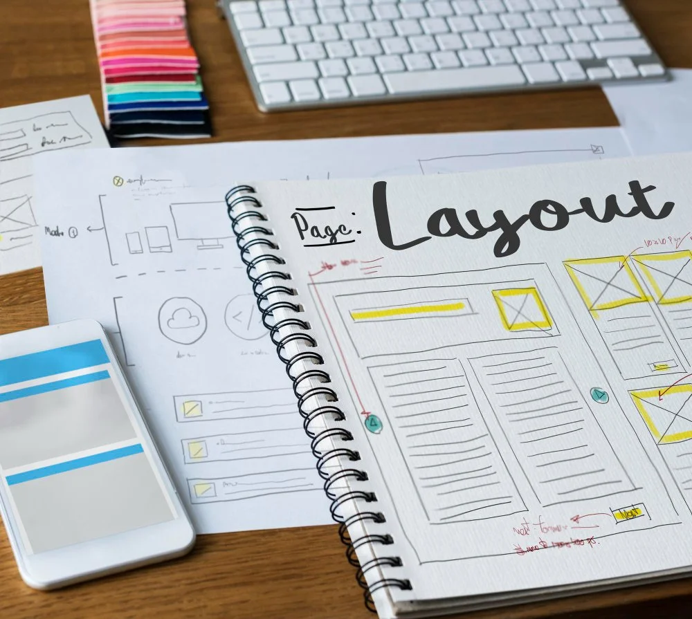
So What Does a Brand Refresh Actually Involve?
A refresh doesn't always mean starting from scratch. Sometimes it's about evolution, not revolution.
It might mean refining your logo for better versatility. Tightening your colour palette. Defining your typography properly. Creating a suite of assets — templates, icons, patterns — that give your brand visual depth. Writing clear guidelines so everything stays consistent going forward.
The goal is to take what's already working and build on it — so your brand feels like the natural next chapter of your story, not a random rebrand.
Ready to Take a Fresh Look?
If you've nodded along to more than one point on this list, it's worth having a conversation. A brand refresh doesn't have to be daunting or expensive — it just needs to be intentional.
At Joe Woodley Design, I work with small businesses and organisations across Suffolk and the UK to create brand identities that are clear, consistent, and genuinely fit for purpose. Let's talk about where your brand is now, and where it could go.
Joe Woodley Design is a freelance graphic design studio based in Bury St Edmunds, Suffolk.