Kheper C is a Cambridge-based Community Interest Company with a bold mission: to empower underrepresented groups, young people, and those seeking personal and professional growth through education and skills development.
They needed a brand that could walk a fine line — professional enough to be taken seriously by funders and partners, but warm, colourful, and accessible enough to genuinely connect with the communities they serve.
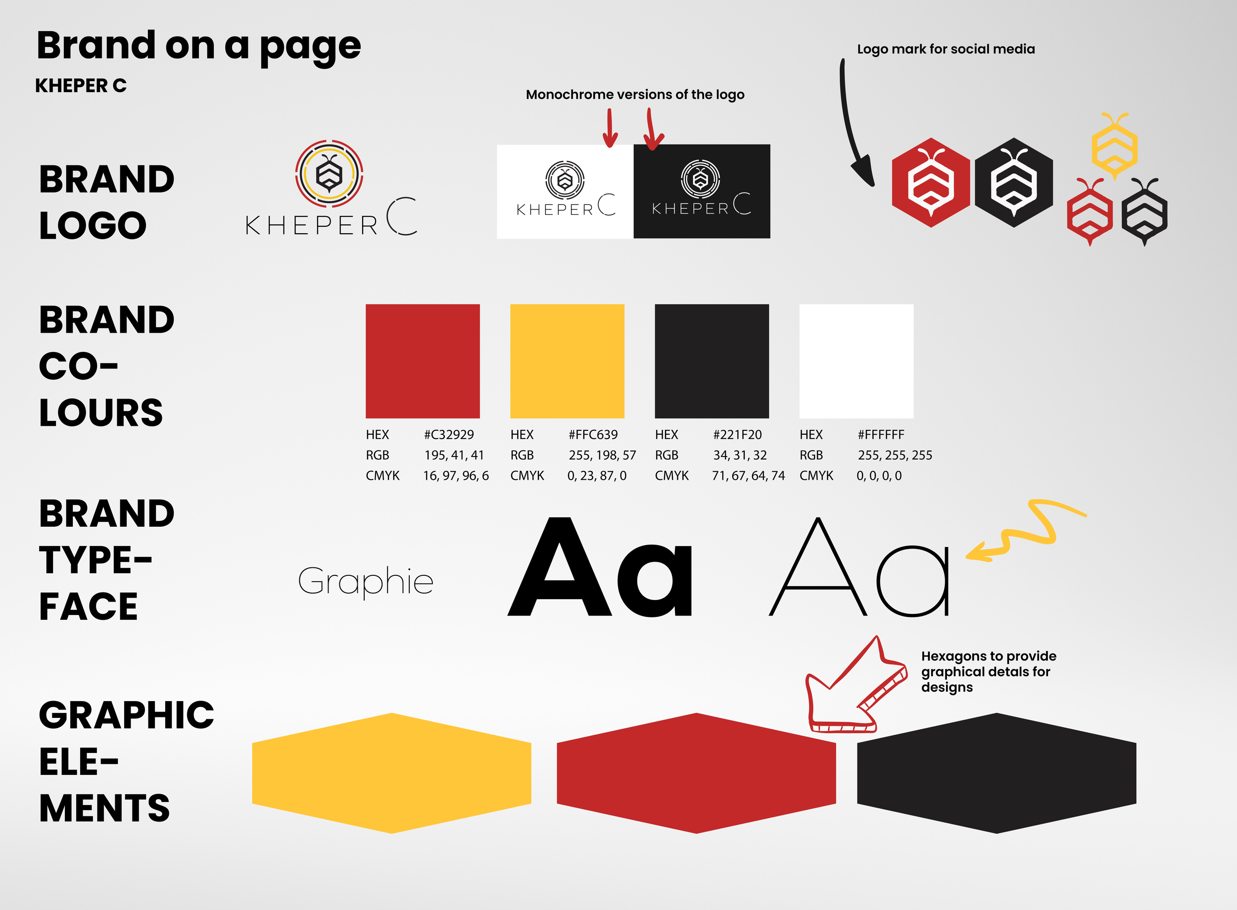
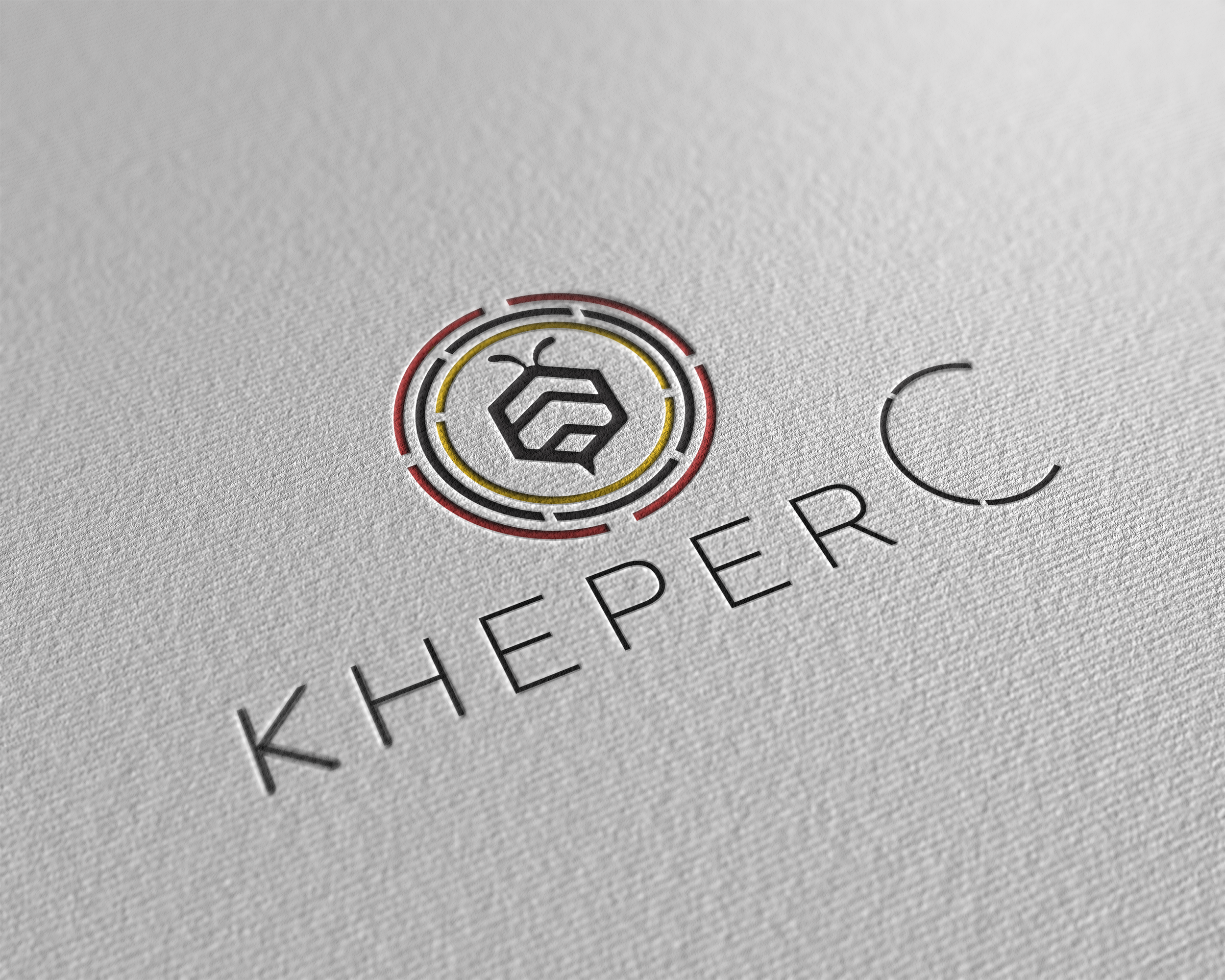
The brief centred around three things: a bee motif (a nod to community, collective effort, and the Cambridge region), a vibrant colour palette, and a visual identity that felt welcoming rather than corporate.
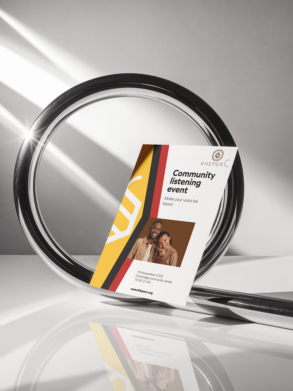
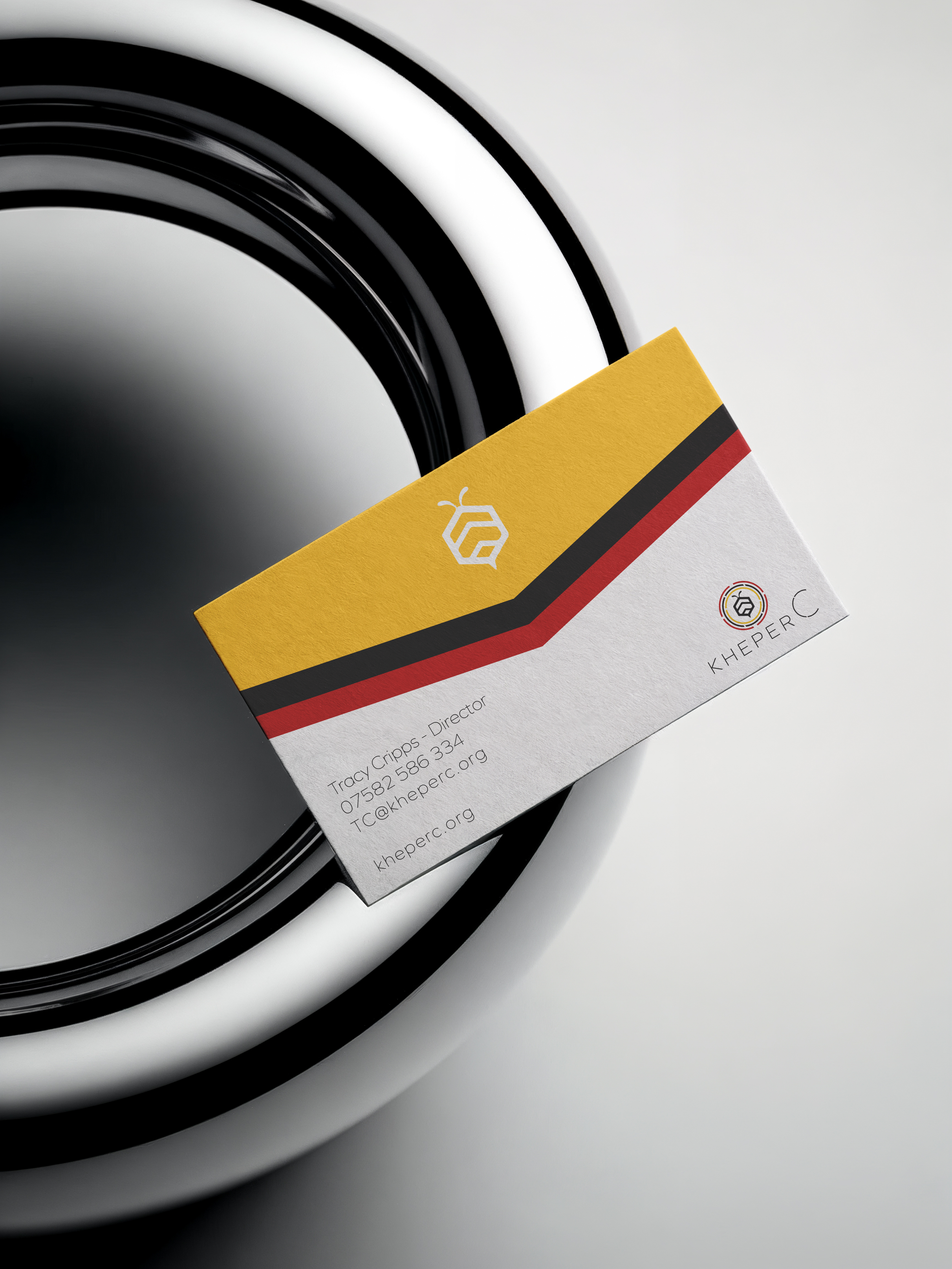
The result is a brand identity that feels alive and purposeful — bold enough to make an impression, approachable enough to open doors, and consistent enough to carry across everything from printed materials to digital communications.
Services provided: Logo design, brand identity, colour palette, typography