
Case study - Health Sense
Health Sense Wellness is a small but well-established health and well-being business that has been trading successfully for the past seven years. Known for its dedication to improving the health and wellness of its clients, the company prides itself on offering high-end treatments and personalised care.
When Health Sense Wellness approached me to revamp their visual identity, I was excited to take on the challenge of creating a design that would truly reflect their core values and elevate their brand presence
The brief: design a new visual identity that conveyed the premium quality of services that Health Sense Wellness provides.
To achieve this, I selected a sophisticated colour palette of gold and deep blue. The use of gold symbolises luxury, excellence, and high-end service, which aligns perfectly with the level of care that clients receive. Deep blue, on the other hand, evokes a sense of trust, calm, and professionalism, reinforcing the company’s commitment to providing a serene and trustworthy environment for its clients.
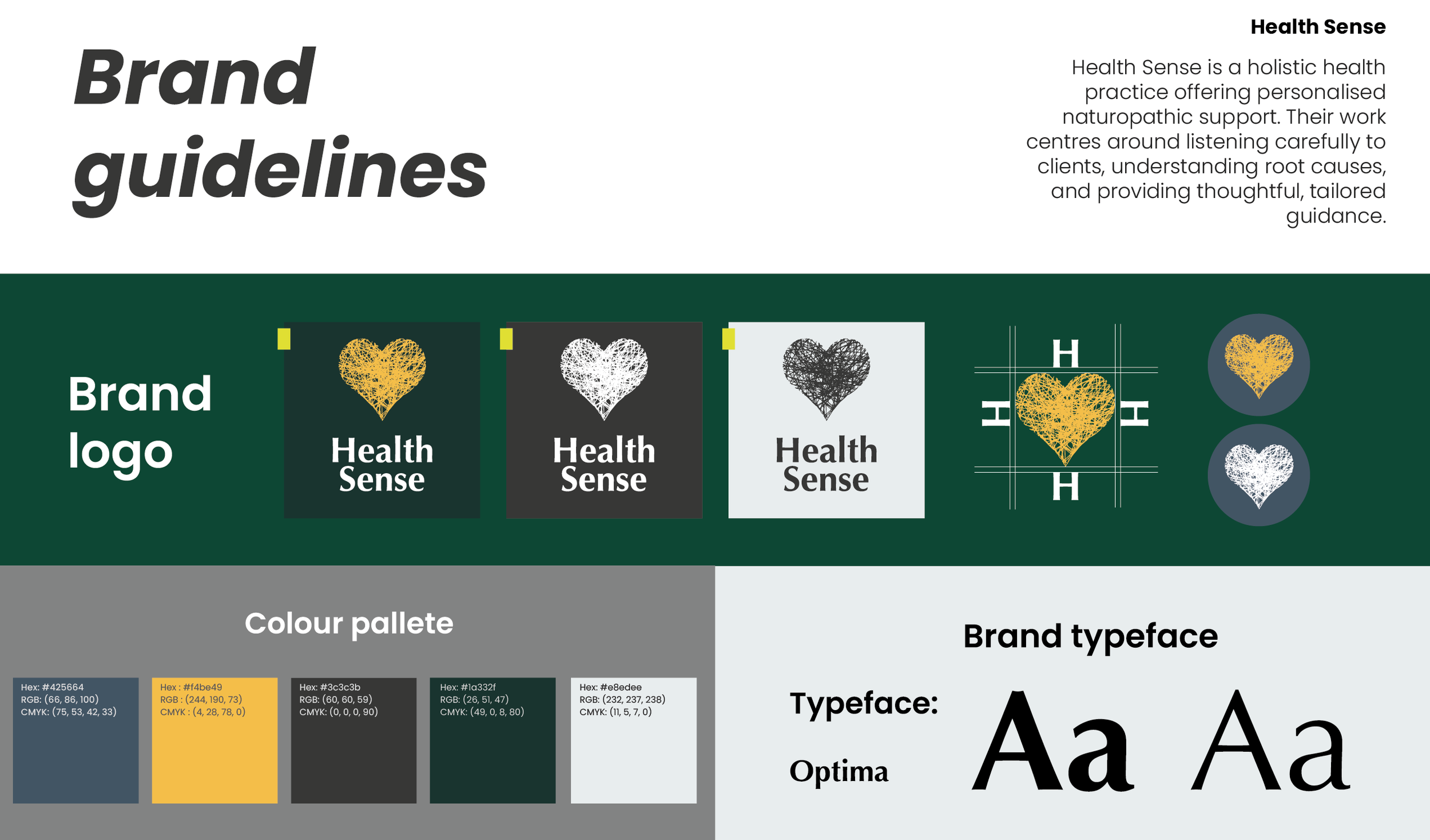
Health Sense brand guidelines
To further enhance the brand's identity, I incorporated sketches of plants and herbs into the design. These elements were chosen to reflect the holistic and natural approach that Health Sense Wellness takes in its treatments. The botanical illustrations add a touch of elegance and authenticity, highlighting the company’s ethos of using natural methods to promote health and well-being.
The revamp included a comprehensive suite of branding materials. I designed new business cards that feature the gold and blue colour scheme along with the botanical sketches, ensuring that the brand’s new identity is immediately recognisable and memorable.
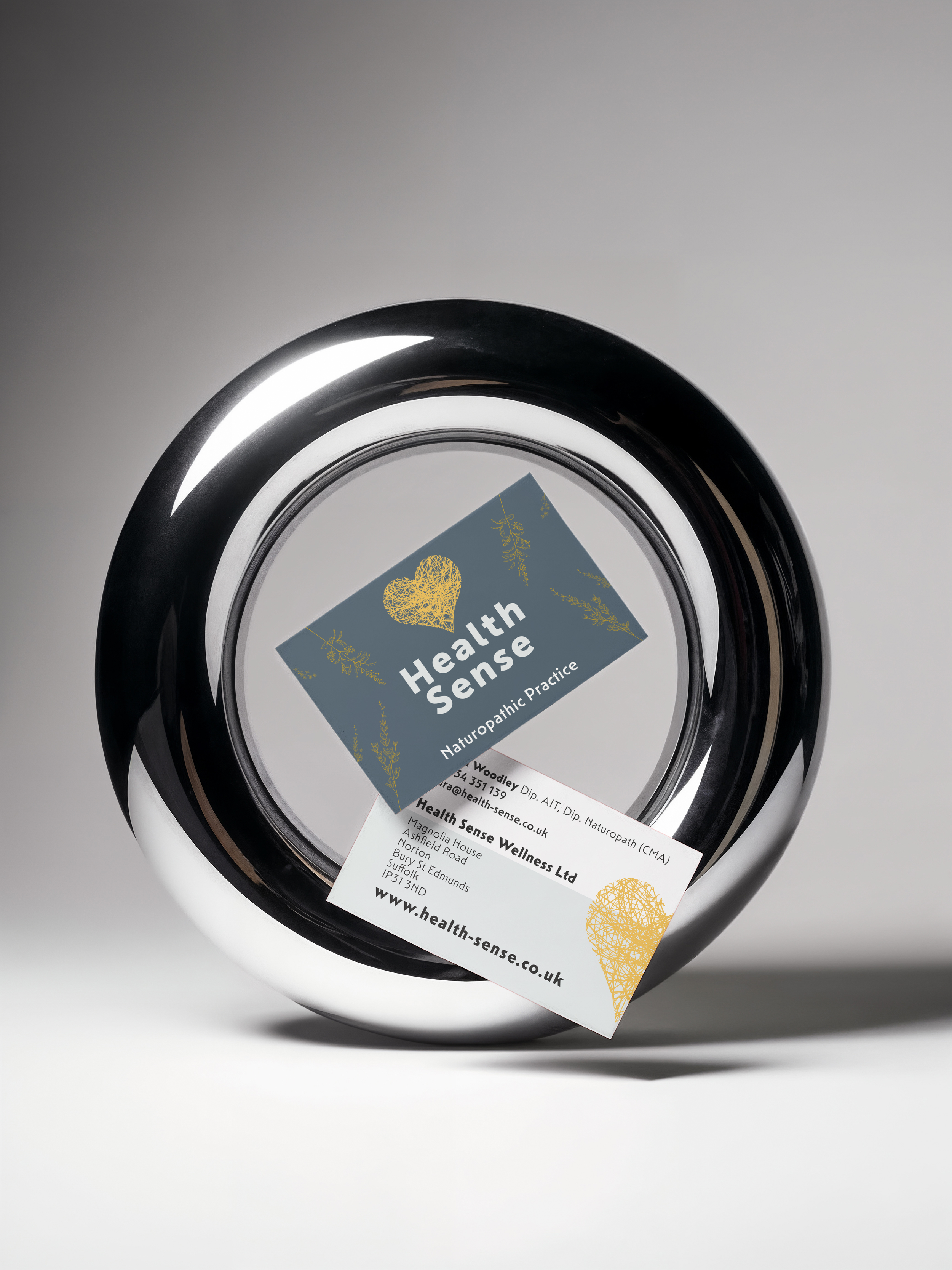
Health Sense business card
These business cards serve as a tangible representation of the company’s values and commitment to excellence.
Additionally, I created patient booklets that provide valuable information about treatments and services. These booklets are designed to be both informative and visually appealing, making use of the new colour palette and illustrations to create a cohesive and engaging reading experience.
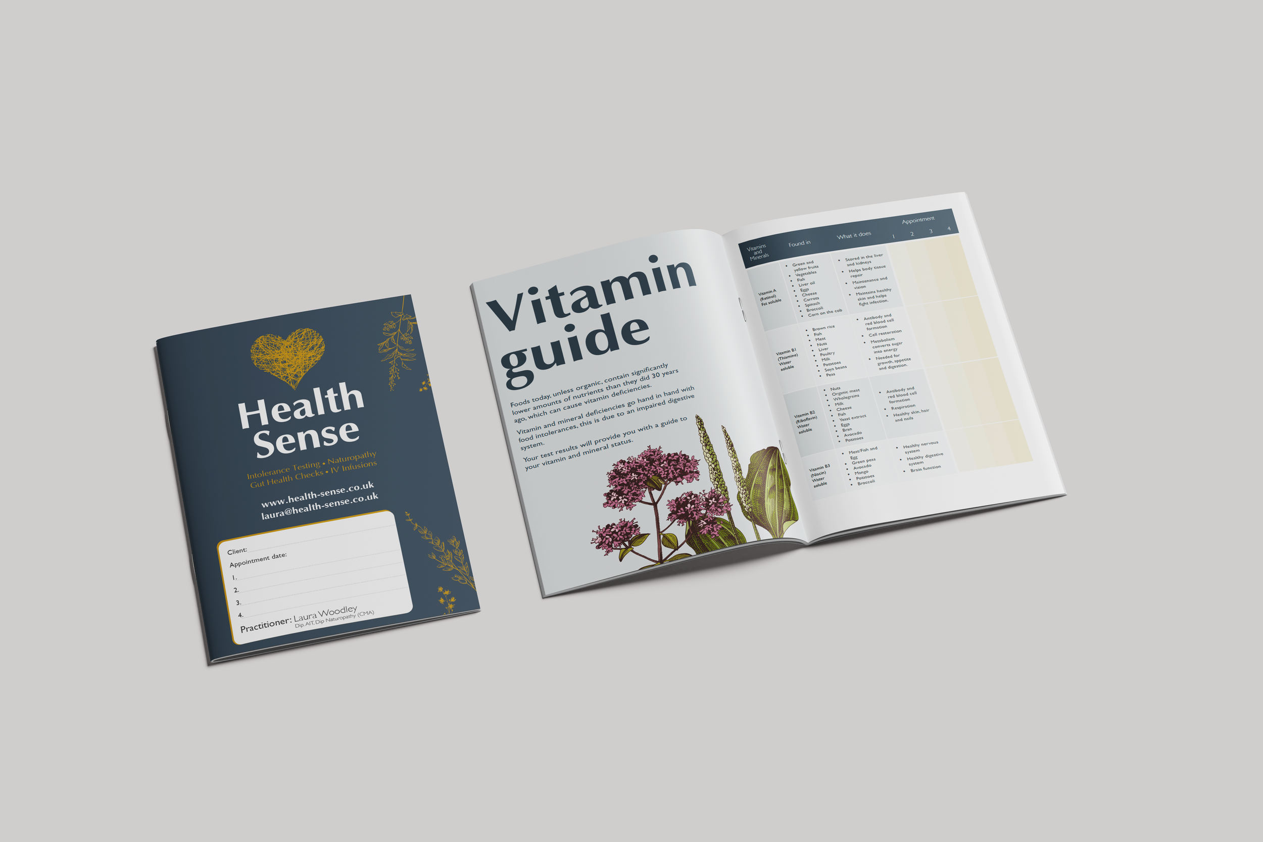
Health Sense customer booklet
Social media assets were also an important part of the project. I developed a range of graphics and templates for Health Sense Wellness’s social media platforms, helping them to maintain a consistent and professional online presence. These assets are designed to capture attention and convey the brand’s premium quality and natural approach.
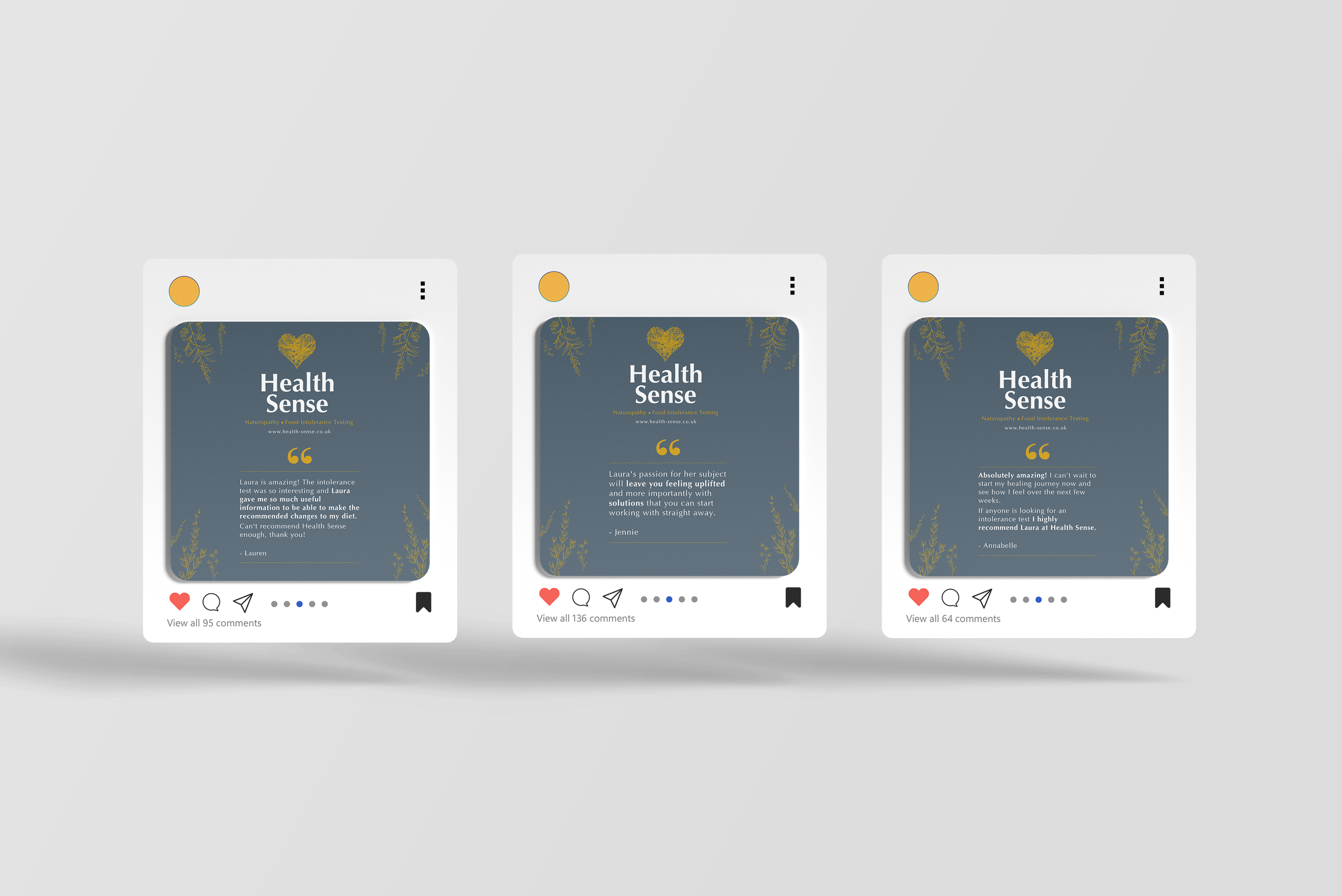
Health Sense social media assets
Gift certificates, pop-up banners, and metal A-boards were also part of the revamped visual identity. The gift certificates were designed to be elegant and enticing, making them a perfect representation of the high-quality treatments that Health Sense Wellness offers. The pop-up banners and A-boards, used for events and promotions, were created to stand out and attract attention, featuring the new branding elements prominently.
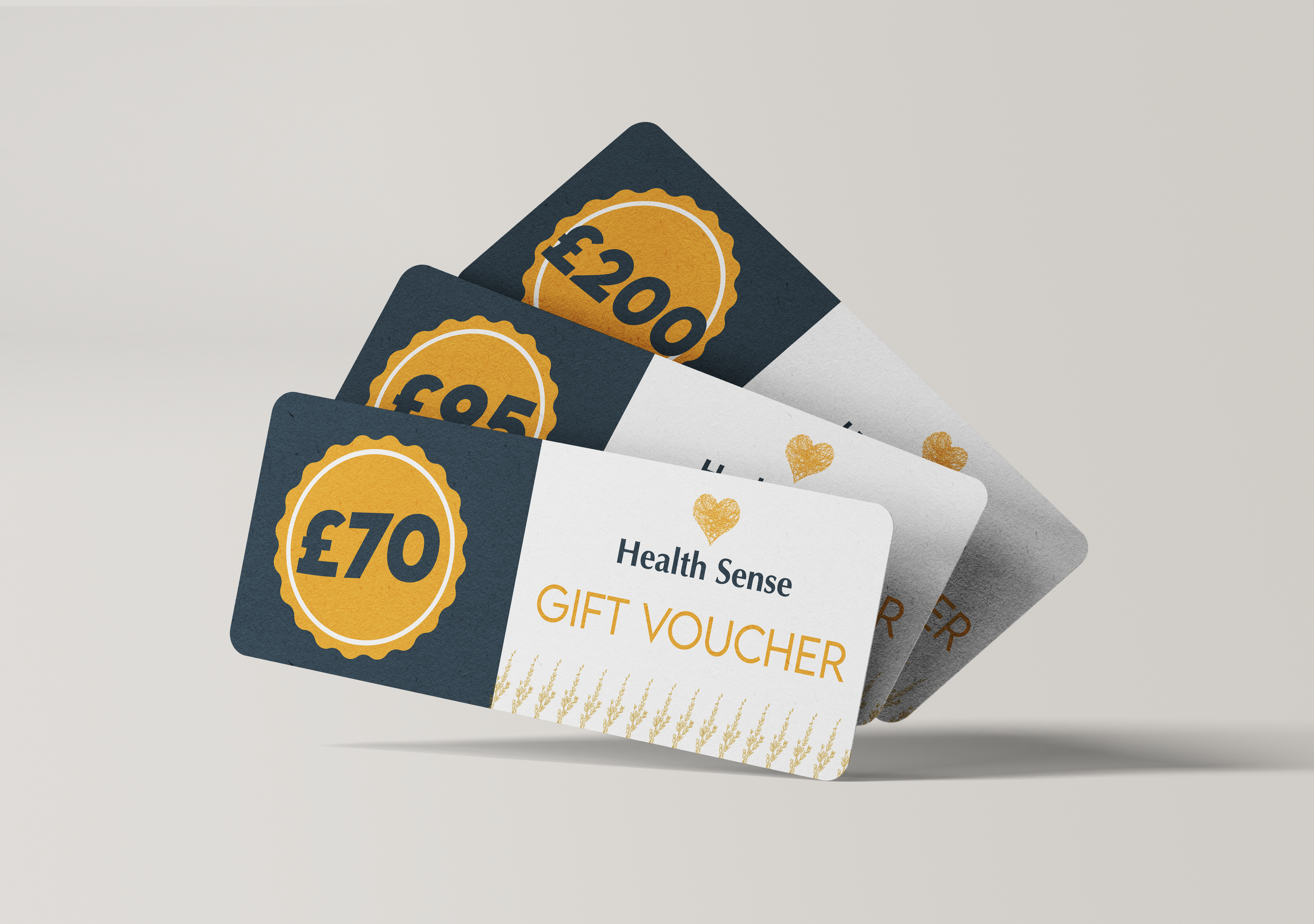
Health Sense gift vouchers
Working with Health Sense Wellness on this visual identity revamp has been a fulfilling experience. The new design not only enhances the company’s brand presence but also effectively communicates their dedication to providing high-end, natural health and wellness services. I am confident that this revamped visual identity will help Health Sense Wellness continue to grow and attract new clients, while maintaining the trust and loyalty of their existing ones.